Tuesday, 25 March 2014

Research -Terry Richardson.


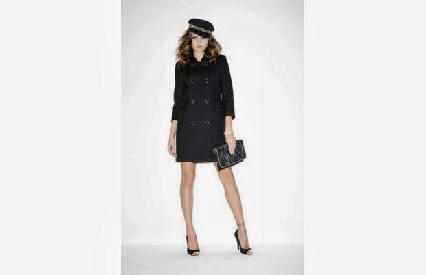
Terry Richardson's work is like no other. At times provocative and troubling, this geniusof fashion imagery reinvented the codes of photography with his snapshot style and use of light. His raw images, provocateurnature and sometimes borderline sense of humour, are enough to introduce this cult photographer.
With some props in the studio I am going to re-create some of these photos with my model Jess. 


I really like the pose the model is making in this image, I have glasses as a prop so i am going to get a few shots of my model Jess doing something similar.


Although not the same outfit, for my photo shoot today my model Jess is wearing a black and white outfit,  so I'm going to take a few shots of her striking this pose. 


The model in this photo has a really glaring look on her face, I had previously planned before seeing this image to take some photos of my model glaring, so I am going to ask her to pose like this.  


I like the really strong facial expressions on the model in this image, I'm really dragged in because she's looking straight down the camera. My theme for this assignment is 'eXpressions' so because of this I am going to take a photo in the same kind of way


I like how the model in this photo is looking towards you but not quite at you, and how the plain  background doesn't make any distractions. 

Research -Nick Knight.


Dazed and confused.
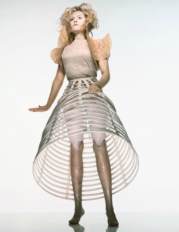
Aimee Mullins, Access-able , September 1998

Alexander McQueen.
Devon, 1997

British Vogue.
June 1998

Arena homme Plus
Beasting, Spring/ Summer 2007

Vogue Hommes Japan
2010

When I 1st saw this picture I really wanted to re create it. I like how dark the image is, but how there is still enough light to see details on the model. I like the hairstyle and how it is all scraped back and really dark, and then there is the contrast of this really bright white cigarett resting on their ear. This image really caught my eye.

Nick's previous work for i-D magazine.
2010 

Nick's previous work for i-D magazine.
2010

Vanity Fair
2010

i-D Double Page Spreads.


These are some previous double page spreads from i-D magazine. I am looking trough these not only to give me inspiration to create my own, but also guide lines so I can see how to make mine similar so it would look like it was actually in an i-D magazine.


I am going to create my double page spread in a similar layout to previous magazines, but I am not going to use this layout as it is manly writing and will not really give me much space to show off my images.


I really like the layout of this double page spread, I think I'm going to use something similar!  I  like how there is a page of writing, but in a large font so there isn't a large amount of writing to read, and then how the second page is 1 large image thats really eye grabbing. Or I could change it and use various smaller images to take up one page. 


This layout could work really well for my theme 'eXpressions'  theres potential for loads of different images to be used, but I am not going to use this layout as I prefer the previous one.


Wednesday, 12 March 2014

Bodies In Space.


Yesterday our class was given the task to get in to small groups and go out and take pictures inspired by Willi Dorner’s Bodies in space series. Unfortunately due to some people being off in my class our group was a very small one as there was only three of us. Me, Fluer and Jess. When we went out to take pictures we realised that with one of us having to take the actual image only two of us could be in the image so we decided because our group was smaller than the others we would do a bit of a twist and took some pictures in small crowded places, but then we also took other images in really open spaces, to make complete opposites. 

Contact Sheet

Contact Sheet
Out of all the photos we took yesterday, this one of me and Fleur in the ‘Marmite Jar’ is my favourite. I love how the image has been taken straight on, directly facing us, but you cant see us because we both have our heads down and our faces covered. I also like the use of colour in this image, although we are dressed quite dark in this image with not many different colours, I like all the mixed shades of blues and greens running trough.

'Marmite Jar'
Once we where back from taking the images we where told to sit in our groups and choose what we thought where the top 5 pictures.These are the ones that we chose... 
Open Space

Relaxing

Marmite Jar

Baby Swings > Small Space

Swings


Willi Dorner.


Austrian artist Willi Dorner squeezes human bodies into nooks and crannies for his Bodies in Urban Spaces project. Groups of dancers, climbers and performers wearing brightly coloured clothes run through busy malls and high streets and cram themselves into doorways, alcoves and any gap they can find in public buildings. During a tour of Austria, England, France, Norway, Sweden, Finland and the US.

Tuesday, 11 March 2014

i-D Magazine Cover.


This was my attempt of making my own i-D Magazine cover. Overall I’m not really pleased with the result of my i-D magazine cover. Although Liam looks good he is not the model I wanted to use. Also I don’t like the shadow on the wall to the left of him. I would have preferred to take my photos in the studio, where I can control the lighting, shadows and there wouldn’t be any background distractions. Also the ‘X’ that Liam has made with his arms is off, ideally it would be accurate. If I had taken the image on a tripod then lines from the bricking in the background would be straight where as in this image they are tilted slightly to the left.  I did manage to stick to the original i-D cover traits of having the logo in the top left corner and the model having their right eye closed/winking.  Also including a barcode to show it’s a magazine and not a poster.


My 1st attempt of creating my own i-D magazine cover.

A-Z


For this mini task we had to go out and take pictures to go with our letter and chosen theme. I found it difficult to come across things that represent ‘eXpressions’ other than people’s faces, and hand gestures. but I found that the Yamaha logo worked quite well for this as it sort of has an X in the middle of it. Once I came back with my image I had to import it onto Photoshop and edit the image so that it was the background filling in a large X, but before I did this I changed the colour from bright red to a pale pink. I did this because I think pink is happy but relaxing colour, and I prefer it to red.
I think that my edited image turned out quite good although if I where to do it again I would move it slightly to the right just to make it perfectly central. This was due to me not looking closely enough, but apart from that I think that my image turned out well. I like the pink that I have used; I wish I could get it the exact same pink as on the Beyonce album cover, and I also like the pattern that emerges within the X. I chose a white background as there is white in the image, as well as that when it is printed out the background will be the same colour as the paper.